
Materials and Methods: Design Principles from Tokyo
Published 10/28/2026 in Scholar Travel Stipend
Written
by Neo Phuchane |
10/28/2026
No one ever thinks twice about the simplicity of a nasal spray, yet it's the reason an untrained bystander can use Narcan to save a life. Continuous glucose monitors translate complex blood sugar data into real-time, accessible readings on your phone. A COVID test turned a lab assay into two lines anyone can read at home. As someone interested in building healthcare technology, I'm fascinated by how great user interface and user experience (UX/UI) design makes groundbreaking solutions ubiquitous.
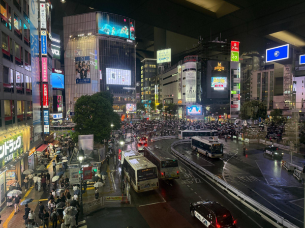
In line with the Milken Institute’s mission to drive innovation, I wanted to broaden my design reference library by exploring Tokyo. From Blade Runner-esque LED signs to the buried archives of vintage collections, the city is brimming with diverse design choices I was eager to absorb. Across my search, several key inspirations stood out, reinforcing the importance of tactility and empathy.
A core facet of Japanese design is its culture of collecting. During the Edo period, the rising merchant class drove demand for paintings, textiles, ceramics, and lacquerware (Coman, 2021). That taste later evolved into new lineages of vinyl toys, posters, and other memorabilia that have since expanded worldwide. While exploring these familiar objects in Tokyo, I visited a store called Vintage Tokyo and stumbled across a collectible I had never seen anywhere else.
Posters and magazines wrapped in plastic jutted out from shelves like jagged rocks. Above me, towering movie posters hung on strings, slowly rotating as hot air blew from the vents above. As I carefully inched through the cramped hallway, I saw crates stacked on crates, filled with carefully wrapped booklets. After a conversation with the store manager, I learned these were movie pamphlets originally sold in theaters. They featured beautiful stills from a movie intertwined with fun facts and production details, including background on the actors, soundtrack details, and even excerpts from critics.
Some hung on the walls, but one caught my eye more than the rest: Taxi Driver (1976). It was one of the store's oldest copies, and clearly weathered. The corners were abraded; the white paper's edges had yellowed. And yet, those imperfections made it all the more magnetic. They showed how the pamphlets were built to last, meant to be treasured long after the credits rolled. Although I hadn’t seen the movie in years, flipping through its pages instantly transported me back into its gritty world. The simple act of feeling the pamphlet’s weight and texture created a surprising sense of connection, making me curious about why touch feels so powerful and leading me to explore the science of tactility. I soon discovered how closely touch is linked to emotion and behavior. At the cellular level, sensory neurons in the skin detect pressure through mechanosensitive channels, which send signals to the brain that shape our tactile experiences. The brain then interprets these signals differently depending on countless factors, such as nostalgia and trauma, as well as the object's temperature and texture (Ugurlu, 2026). This layering of physical and emotional meaning helps explain why tactility can so powerfully shape our behavior. For instance, researchers Peck and Shu showed that simply handling a product can spark a sense of ownership before you even buy it (Peck and Shu, 2009). The impact of touch extends even further in healthcare; Guéguen et al. found that patients touched during a medical exam were more likely to take their prescribed antibiotics a week later (Guéguen et al., 2010).


These findings made me reflect on the power of tactility in health technology. Instinctively, I thought of the Oura ring on my finger. One detail in the Oura app that stands out is that when you tap and hold your heartbeat graph, the phone vibrates subtly, pulsing in sync with your heart. It’s a minor feature, but it transforms raw data into something you can literally feel, helping you connect your biology to the software in a tangible way. Moving forward, I’m eager to see how these details can inform future product design, and excited to apply what I’ve learned to make software as vivid and memorable as holding an object in your hands.

In contrast to Jimbocho's quiet streets, the electric town of Akihabara felt like the type of fever dream you get after overdosing on sour Skittles. After dodging the monsoon of LED lights outside, I entered a massive nine-floor department store, where I was kindly welcomed with bright yellow signs, blaring announcements coming from the speakers, and the GTA 6 trailer playing on every big-screen TV. An omnipresent hum of machines filled the air. Each floor had its own unique DNA. The toy section had hundreds of Gundam figures posed like screenshots from the TV show, while the camera section was a maze of endless rows of camera models and screens. Yet across all of the chaos, one thing never changed: the signage design.

Every inch of the store was covered in dense, exclamation-mark-filled signs that seemed designed solely to scream in your face. To my surprise, however, it was actually an expression of hospitality. With more context from my friend and other customers, I learned that in Japan’s culture of politeness, designers cram signs with information to ensure shoppers aren’t misled. They want people to make truly informed decisions, so they sacrifice white space to convey as much detail as possible. That understanding completely flipped my view of design. I was accustomed to the “user-friendly” Swiss-design philosophy that dominates most Western modern software and websites. Namely, I had developed a taste for anti-chaotic design built on structure and balance, akin to Japan's minimalistic Zen design language, popularized by brands like Uniqlo and Muji. I grew to believe that grid systems and neutral colors were the default. But I realized that truly effective design isn’t always about aesthetics. Rather, it’s about meeting the user where they are and solving the problem at hand. In a mega-department store, where shoppers face a stampede of choices, a loud, information-packed sign might be exactly what’s needed.
I left Tokyo with a duffel bag full of source material and a clearer understanding of how to maximize design’s true impact. These lessons will shape how I approach healthcare design, from creating tangible experiences to solving real problems with empathy. I want to build products people trust because they feel personal and clear, and I’ll carry these insights into everything I build next.
References
https://smarthistory.org/edo-period/
https://www-apache.anderson.ucla.edu/faculty_pages/suzanne.shu/JCR%20touch%20ownership.pdf
https://pubmed.ncbi.nlm.nih.gov/20589438/
https://pmc.ncbi.nlm.nih.gov/articles/PMC12895057/
Author(s):
